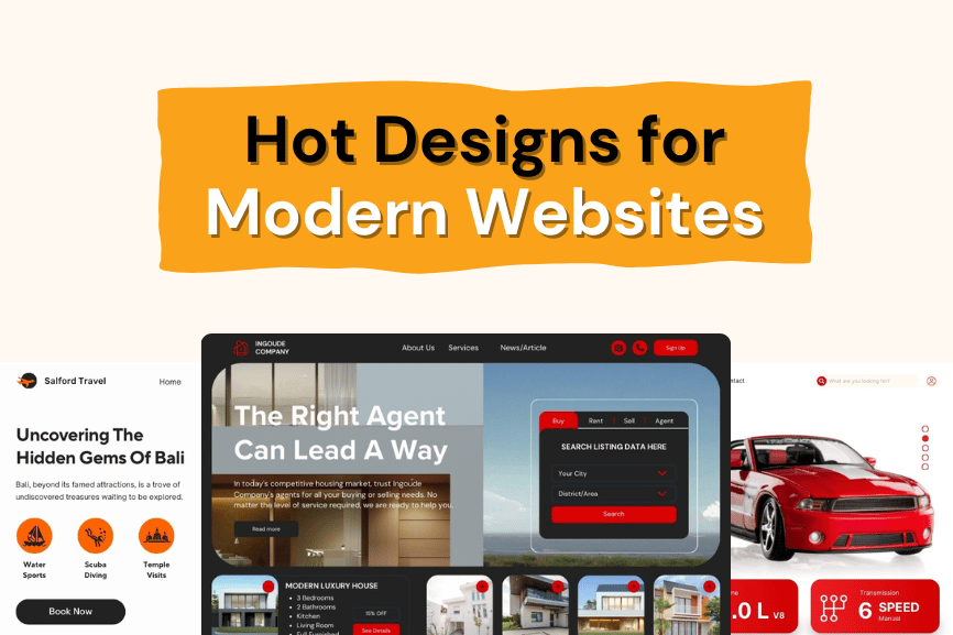
In the fast-paced world of web design, staying on top of trends is essential for creating websites that captivate and engage users. Here’s a breakdown of the hottest trends shaping the industry:
Creating Eye-Catching Experiences
1. Night Owl’s Paradise: Dark Mode
- What it is: A visual theme that’s easy on the eyes, especially in low-light environments.
- Why it matters: Reduces eye strain, conserves battery life on mobile devices, and gives a sleek, modern look.
- How to use it: Implement a dark mode toggle on your site or offer it as the default setting for a sophisticated aesthetic.
2. Sophistication with a Twist: Neumorphism
- What it is: A design style that creates a 3D effect using subtle shadows and gradients.
- Why it matters: Adds depth and dimension without overwhelming the user.
- How to use it: Apply neumorphism to buttons, input fields, and cards to give them a soft, tactile appearance.
3. Small Touches, Big Impact: Micro-Interactions
- What it is: Tiny animations and effects that respond to user actions.
- Why it matters: Enhances user experience by providing feedback and engagement cues.
- How to use it: Use hover effects, scrolling animations, and progress indicators to guide users and make interactions intuitive.
Prioritizing User Experience
4. Clean and Simple: Minimalism
- What it is: A design philosophy that emphasizes simplicity and clarity.
- Why it matters: Improves site speed and usability, making content the focus.
- How to use it: Incorporate ample white space, clear navigation, and a streamlined layout to make your site clean and efficient.
5. Mobile First: The Small Screen Reigns Supreme
- What it is: Designing for mobile devices first, then adapting for larger screens.
- Why it matters: Ensures your site works well on mobile, which is crucial as mobile browsing surpasses desktop.
- How to use it: Start with a responsive design framework and prioritize mobile usability in your design process.
Embracing Cutting-Edge Technologies
6. Beyond the Screen: Augmented Reality (AR) and Virtual Reality (VR)
- What it is: Technologies that blend virtual elements with the real world or create immersive digital environments.
- Why it matters: Offers interactive experiences like virtual try-ons or 3D product exploration.
- How to use it: Integrate AR/VR for product showcases, virtual tours, or interactive storytelling.
7. Engaging with Motion: Motion Design
- What it is: The use of animations and transitions to enhance user interaction.
- Why it matters: Guides users, provides feedback, and makes the experience more engaging.
- How to use it: Implement animations for page transitions, button clicks, and scrolling to add life to your site.
Accessibility for All
8. Inclusive and Accessible Design
- What it is: Designing websites usable by people with disabilities.
- Why it matters: Expands your audience and complies with standards like WCAG.
- How to use it: Ensure keyboard navigation, screen reader compatibility, and sufficient color contrast in your design.
Standing Out from the Crowd
9. Unique Personality: Custom Illustrations
- What it is: Using hand-drawn or unique illustrations instead of stock images.
- Why it matters: Reflects your brand’s personality and makes your site memorable.
- How to use it: Commission custom illustrations that align with your brand’s voice and story.
10. Bold and Beautiful: Typography Makes a Statement
- What it is: Using large, distinctive fonts to create a visual hierarchy.
- Why it matters: Enhances readability and visual appeal across devices.
- How to use it: Choose fonts that are legible and striking, and use them strategically to draw attention to key content.
Technical Advancements
11. Seamless Browsing: Single Page Applications (SPAs)
- What it is: Websites that load all content dynamically on a single page.
- Why it matters: Provides a faster and smoother user experience.
- How to use it: Use frameworks like React or Vue.js to build SPAs for content-heavy or interactive sites.
12. Stepping into the Third Dimension: 3D Elements
- What it is: Adding 3D graphics and elements to web design.
- Why it matters: Creates an immersive experience and makes content more engaging.
- How to use it: Incorporate 3D elements sparingly to enhance, not overwhelm, your design.
13. Breaking the Mold: Asymmetrical Layouts
- What it is: Using unconventional, non-grid layouts.
- Why it matters: Makes your site stand out and creates visual interest.
- How to use it: Design with asymmetry in mind while maintaining balance and navigability.
These trends not only enhance the aesthetics of your website but also improve user experience and accessibility, making them essential for modern web design. By adopting these strategies, you can create websites that are not just visually appealing but also functional and inclusive.


